Argonne Leadership
Computing Facility
Unified visual system for a supercomputing facility, from printed reports to live machine status
- Year
- 2016–present
- Role
- Print and web design, development
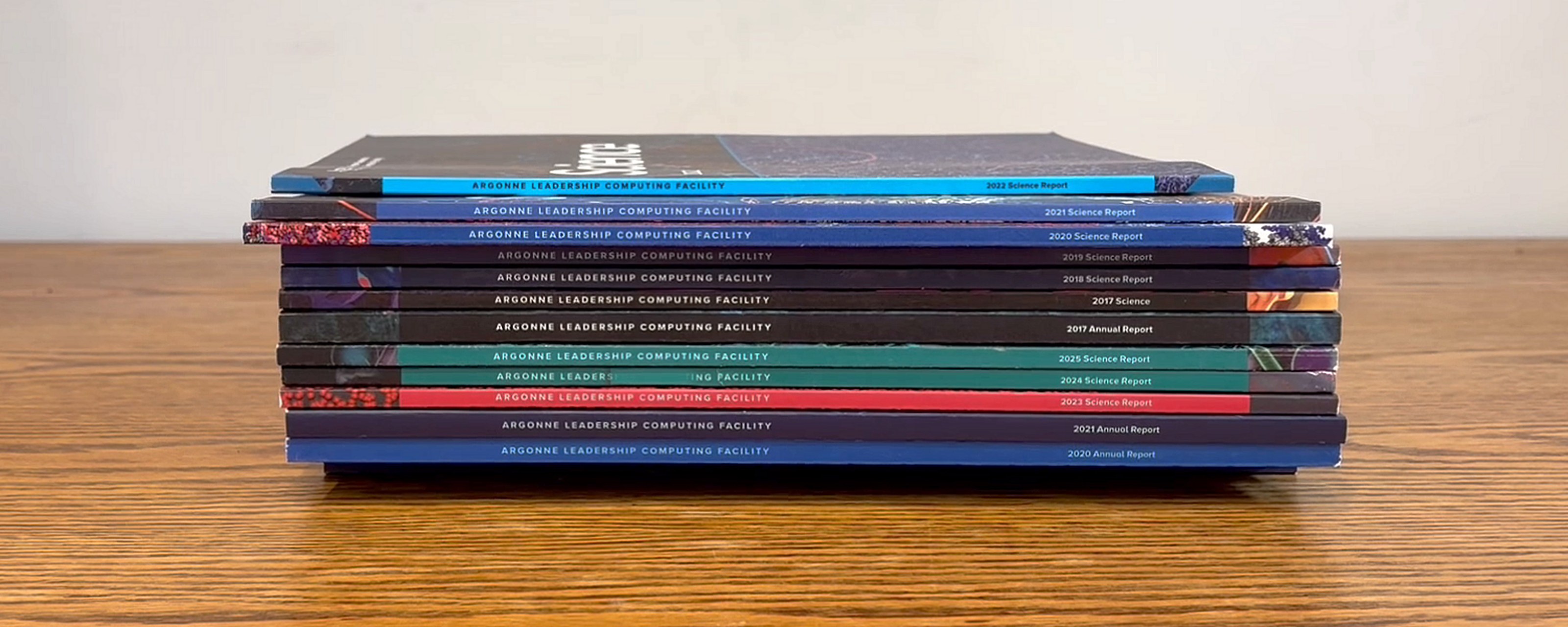
The Argonne Leadership Computing Facility runs some of the world’s most powerful supercomputers built for open science. At Sandbox, our job is to make the facility clear to everyone it serves: the scientists who apply for time on the machines, the public who funds them, and the staff who keep it all running. We started with the reports in 2016 and grew into ALCF’s de facto in-house design team, usually with several projects under way at once. I lead design across print and online. I designed the site and built its live machine-status graphics, and I designed and implemented the system behind the user documentation, which the scientists write themselves. On strategy and UX, I work alongside Beth Cerny, ALCF’s communications lead.
The result
The site relaunched in 2020, and it’s the clearest measure of the work. From 2023, when reliable analytics begin, to 2025, active users grew from 40,000 to 151,000, nearly four times in two years.
Building a brand one report at a time
ALCF had no budget or appetite for a full branding process, so the brand grew out of the reports instead. Each year brought a new annual report and science report, and each one let us show what a consistent look could do, rather than ask for sign-off on a brand up front. A few pieces carried from year to year: the ALCF letterforms and the year drawn in diagonal rules, a strip of scientific visualization down each cover’s edge, and bold single-color contents pages. That consistency won people over, and the look spread to posters, infographics, and event banners.
The reports changed too. The science report stays in print, but the annual report moved online, where it reaches more than the few who were lucky enough to land a printed copy.


A refresh for the exascale era
The previous site dated to 2011, and we rebuilt it as the facility moved into the exascale era. It serves two audiences: researchers managing their computing campaigns and reading documentation, and a public that comes for the science. I designed it so each gets straight to what it came for.
The home page shows a live status graphic for each of the four machines, Aurora, Polaris, Sophia, and Crux: whether it’s up, how many jobs are active, queued, and reserved, and how many nodes are in use. The machine-status page goes deeper, into the running jobs themselves. I built these in d3.js from live JSON feeds, one per machine, so the page works less like a brochure and more like an instrument panel.
A system others can build on
Much of what ALCF publishes is written by many hands, so we built the tools around the writers. The annual report and the user documentation both run on GitHub-based workflows. Contributors, including the scientists who write the docs, draft and revise in one place, and the design holds no matter who’s writing.
The brand reaches past the main site, too. It’s packaged as a theme, and ALCF’s sub-organizations run their own sites on it, each with a home of its own that still reads as ALCF.
The work keeps growing. We’re bringing more animation, video, and interactive graphics into it. Argonne is also building its next generation of systems for the Department of Energy’s Genesis Mission, among them Solstice, powered by 100,000 NVIDIA GPUs. As each one comes online, it gets a feed and a status panel of its own.


